
6 lessons · about 29 min
Start with the essentials
Build a foundation in focus, native controls, labels, images, links and headings.
THE ACCESSIBILITY LESSONS
Build accessibility skills through short exercises, working examples and choices you can explain. Start with the essentials or choose a path for your next task.
Self-paced · No account needed · Time estimates are a guide, not a time limit.
YOUR LEARNING
Progress and application notes stay in this browser. They do not sync across devices.
A practice record helps you learn; it is not a certification or a conformance score.
CHOOSE A STARTING POINT
6 lessons · about 29 min
Build a foundation in focus, native controls, labels, images, links and headings.
8 lessons · about 40 min
Practise controls, feedback, dialogs, motion and sign-in tasks.
6 lessons · about 32 min
Connect words, images, structure, media and adaptable layouts.
6 lessons · about 33 min
Follow the evidence from visual presentation and forms to feedback and authentication.
READ → TRY → EXPLAIN → APPLY
Open a lesson, try its exercise, check your understanding, then note one change for your own work. Mark it as practised when you are ready.
16 lessons available.
No lessons match these filters. Try fewer search words or reset the filters.
Interaction · About 5 minutes
Keyboard focus identifies the control that will receive the next action. A visible indicator helps people follow their place while tabbing, using alternative keyboards or operating through other keyboard interfaces. A control that works but cannot be located is still a barrier.
By the end: Track focus through a short task and recognise when page content hides it.
What to look for: Each focusable control has a visible focus treatment. WCAG 2.4.7 is AA. WCAG 2.4.11, also AA, addresses controls entirely hidden by author-created content; keeping the whole control visible is the better design target. These checks are a starting point, not a full keyboard audit.
Choose a practice step.
button:focus { outline: none; }button:focus-visible {
outline: 3px solid var(--focus-colour);
outline-offset: 3px;
}
/* Check the ring against adjacent colours. */These excerpts explain one idea. Apply and test the complete behaviour in your own context.
Keep in mind: Focus styling is not exclusively for keyboard hardware. The browser can also show it in other situations; do not force it off just because a pointer was used.
Provide a persistent visible keyboard-focus treatment. Correct. Operation and knowing which control is active are separate needs.
Record one change to try and how you will check it. Saved in this browser; avoid personal or confidential information.
Interaction · About 4 minutes
A button performs an action, such as saving a preference or opening a panel. A link navigates to a destination. Using a native button provides useful role and keyboard behaviour, while a clickable generic element requires those behaviours to be implemented and tested.
By the end: Recognise the difference between an action and navigation, then operate an action without a pointer.
What to look for: The action can be reached and operated with expected button keys, and its name describes the action. A native button is a dependable starting point, not a substitute for testing. For navigation, an anchor with a real destination retains familiar browser features.
Practice basket: 0 items.
<div onclick="addItem()">Add item</div><button type="button" id="add-item">Add item</button>
<!-- Attach the action to the button’s click event. -->These excerpts explain one idea. Apply and test the complete behaviour in your own context.
Keep in mind: Adding role='button' describes a role to assistive technology; it does not automatically add focusability, keyboard activation or the action itself.
A native button with a clear label and working action. Correct. Native button behaviour reduces the custom work needed for keyboard and semantic support.
Record one change to try and how you will check it. Saved in this browser; avoid personal or confidential information.
Structure and forms · About 6 minutes
A form needs to explain what each input is for before a person types and while they correct an error. Persistent visible labels support sighted users; programmatic associations let assistive technology identify the same fields. Error text should explain what needs attention.
By the end: Complete and correct a short form without losing the field's purpose or your previous work.
What to look for: Labels stay visible and are associated with inputs. Text identifies errors; colour may reinforce that message. Relevant help or error text is connected to the field, for example through aria-describedby. A useful summary or focus strategy guides correction without erasing otherwise valid entries.
Use fictional details. This practice form does not send or save its fields.
<input placeholder="Email">
<!-- A red border is the only error indication. --><label for="email">Email (required)</label>
<input id="email" type="email" required
aria-describedby="email-help email-error">
<p id="email-help">For example, [email protected].</p>
<p id="email-error"></p>
<!-- On error: explain the correction and set aria-invalid. -->These excerpts explain one idea. Apply and test the complete behaviour in your own context.
Keep in mind: A placeholder is not a reliable replacement for a persistent label. Giving a field an accessible name alone also does not provide every visible instruction a user may need.
Identify the Email field, explain the problem in text, and preserve the entered values. Correct. The person can locate the problem and correct it without reconstructing the form.
Record one change to try and how you will check it. Saved in this browser; avoid personal or confidential information.
Visual presentation · About 5 minutes
Contrast compares foreground and background brightness. It helps determine whether text or an important visual cue is distinguishable, but a ratio does not measure every aspect of readability. Test the actual colours and states people encounter, including text shown over images or tinted surfaces.
By the end: Choose a suitable threshold and improve a sample without relying on visual judgement alone.
What to look for: Under WCAG 1.4.3 AA, ordinary text needs at least 4.5:1; large text needs 3:1. Large means at least 18pt, or 14pt bold. Incidental text and logotypes have exceptions. Essential control and graphic cues have separate 3:1 rules under 1.4.11. Do not round a failing ratio upward.
Ratios are tested before rounding. This example reports text contrast thresholds; other requirements still apply.
/* Judging readability from colour names alone. */
color: grey; background: white;/* Measure the actual rendered colours. */
/* Normal text at AA: at least 4.5:1. */
/* Large text at AA: at least 3:1. */
/* Large: 18pt, or 14pt bold (normally 24px / 18.67px). */These excerpts explain one idea. Apply and test the complete behaviour in your own context.
Keep in mind: A passing ratio does not make tiny, thin or crowded text easy for everyone to read. Keep size, spacing and clear presentation in the review.
No; improve the pair until the unrounded result reaches the threshold. Correct. A value below 4.5:1 does not meet this threshold.
Record one change to try and how you will check it. Saved in this browser; avoid personal or confidential information.
Content · About 5 minutes
The same image can inform, decorate or operate a control in different contexts. Its text alternative should serve that particular job. A product photograph, a decorative divider and an image-only link therefore need different decisions, even when the files look equally detailed.
By the end: Choose between meaningful alternative text, an empty alternative and a fuller description.
What to look for: An informative image has a useful equivalent; a purely decorative image can use alt=''. An image-only control needs an accessible name for its action. A complex chart may need both a short alternative and accessible detailed information. The right choice depends on the page, not a fixed word count.
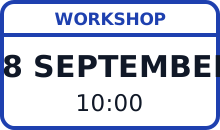
Workshop: 18 September at 10:00.
Informative image: alt describes the workshop information.
<img src="workshop.svg" alt="image"><!-- Choose the alternative from purpose and context. -->
<img src="workshop.svg"
alt="Workshop: 18 September at 10:00.">
<!-- If equivalent text is already nearby: alt="". -->These excerpts explain one idea. Apply and test the complete behaviour in your own context.
Keep in mind: Screen readers do not read every image identically. Output depends on markup, context, software and settings; missing alt does not guarantee one particular filename announcement.
Use an empty alt attribute so it can be ignored. Correct. Empty alternative text intentionally marks this image as decorative.
Record one change to try and how you will check it. Saved in this browser; avoid personal or confidential information.
Interaction · About 5 minutes
People select controls with fingers, mice, pens and other pointing devices. The active area can be larger than the visible icon. Generous targets reduce precision demands, while the gap between neighbouring targets helps prevent selecting the wrong action.
By the end: Evaluate the clickable area and spacing instead of measuring only the picture inside a control.
What to look for: WCAG 2.5.8 AA uses a 24 by 24 CSS pixel minimum with spacing, equivalent-control, inline, user-agent and essential exceptions. For the spacing exception, a 24px-diameter circle centred on the target's bounding box must not intersect another target or another undersized target's circle. The 44 by 44 target belongs to 2.5.5 AAA, with its own exceptions.
These live controls are at least 44 × 44 CSS pixels. Use touch, a pointer or the keyboard to move through the three practice steps.
Practice step 1 of 3.
/* A tiny hit area, crowded by other controls. */
.icon { width: 12px; height: 12px; }/* A generous target can contain a smaller icon. */
.control { min-width: 44px; min-height: 44px; }
/* WCAG 2.5.8 AA has a 24px rule plus permitted
spacing and other exceptions; inspect the full criterion. */These excerpts explain one idea. Apply and test the complete behaviour in your own context.
Keep in mind: A 20px target is not automatically a WCAG failure: an exception may apply. Conversely, meeting a minimum does not guarantee that a control is comfortable for every person.
Check the actual active area and the criterion's applicable exceptions. Correct. Record which requirement or exception you assessed and the evidence.
Record one change to try and how you will check it. Saved in this browser; avoid personal or confidential information.
Content · About 4 minutes
A person may scan a page visually or navigate a list of links with assistive technology. Useful link text reduces the work needed to predict a destination. Repeated phrases such as 'Read more' deserve a context check, rather than an automatic pass or fail.
By the end: Rewrite a link so its purpose is clear, and recognise when surrounding context is sufficient.
What to look for: The destination can be determined from the link alone or with its programmatically determined context, as required by WCAG 2.4.4 A. A clear standalone name is often easier to scan. A purely visual relationship to an unrelated nearby card may not provide the context assistive technology needs.
You are preparing an event video. Follow the captions, transcripts and description guide for the next task.
You can also look up alternative text in the glossary.
<a href="media-guide.html">Click here</a><a href="media-guide.html">
Captions, transcripts and description guide
</a>These excerpts explain one idea. Apply and test the complete behaviour in your own context.
Keep in mind: Every occurrence of 'click here' is not automatically a 2.4.4 failure. Context matters, although more descriptive wording usually makes the link easier to use.
Link purpose may come from the text together with programmatically determined context. Correct. Inspect the actual relationship rather than judging the phrase in isolation.
Record one change to try and how you will check it. Saved in this browser; avoid personal or confidential information.
Structure and forms · About 5 minutes
Headings explain how content is organised and help people move between sections. A large bold paragraph may look like a heading while remaining ordinary text to software. Semantic heading levels should represent the content's relationships, with visual styling handled separately.
By the end: Create an outline that describes both the page's topics and their hierarchy.
What to look for: Real headings identify sections and accurately describe their content. Logical nesting helps convey relationships under 1.3.1; descriptive headings support 2.4.6 AA. One main h1 is a useful convention. A skipped level warrants review but is not, by itself, proof of a WCAG failure.
This is a section heading within the demonstration.
Describe the entrance, route and contact for assistance.
Provide accessible materials before the session.
These are actual nested headings (h5, then h6) within this lesson’s hierarchy. The appropriate levels depend on the surrounding page.
<p class="large-bold">Arrival</p><section aria-labelledby="arrival">
<h2 id="arrival">Arrival</h2>
<p>Describe the entrance and route.</p>
</section>
<!-- Choose levels from the page hierarchy. -->These excerpts explain one idea. Apply and test the complete behaviour in your own context.
Keep in mind: Returning from h3 to h2 is normal when a subsection ends and a new main section begins. Heading numbers are a hierarchy, not a sequence that must always increase.
Check that the new h2 really starts a section at that level. Correct. Judge the content relationship, not a rule that heading numbers must rise.
Record one change to try and how you will check it. Saved in this browser; avoid personal or confidential information.
Interaction · About 4 minutes
A symbol can have different meanings in different places: a magnifier may search or enlarge an image. An icon button needs an accessible name that identifies its actual action. Visible text also helps people who do not recognise the symbol.
By the end: Compare a control's purpose with its accessible name and remove ambiguity.
What to look for: The name describes the action, such as 'Enlarge preview', rather than only the symbol's appearance. A native button can take its name from text, including visually hidden text, or an appropriate naming attribute. Where a visible text label exists, the accessible name includes it under 2.5.3 A.
Example not saved.
The name stays “Save example”; its pressed state changes. This practice toggle does not save your lesson progress.
<button><svg><!-- bookmark shape --></svg></button><button type="button" aria-pressed="false">
<svg aria-hidden="true"><!-- bookmark --></svg>
<span class="sr-only">Save example</span>
</button>These excerpts explain one idea. Apply and test the complete behaviour in your own context.
Keep in mind: An emoji is not automatically hidden from assistive technology. It may contribute a name, but that name may not explain the action. Adding aria-label to every button is unnecessary when good text already supplies the name.
Enlarge product photograph. Correct. The name tells the person what activation will do.
Record one change to try and how you will check it. Saved in this browser; avoid personal or confidential information.
Interaction · About 6 minutes
A modal dialog temporarily makes the surrounding page unavailable while a person completes or dismisses a task. Keyboard focus should enter the dialog, remain in its interaction sequence while open, and reach a sensible place when it closes.
By the end: Test opening, navigating and dismissing a modal without losing your place.
What to look for: The modal has a useful accessible name, suitable initial focus and an accessible exit. APG recommends Escape and an in-dialog close control. Focus normally returns to the trigger, or to a logical next step if the workflow requires it. Native modal behaviour still needs naming and workflow checks.
<div class="looks-like-a-modal">
  <!-- The page behind it remains interactive. -->
</div><dialog id="plan" aria-labelledby="plan-title">
<h2 id="plan-title">Plan name</h2>
<form method="dialog"><button>Close</button></form>
</dialog>
<script>plan.showModal();</script>
<!-- Review initial focus and focus after closing. -->These excerpts explain one idea. Apply and test the complete behaviour in your own context.
Keep in mind: Keeping Tab inside an open modal is not automatically a prohibited keyboard trap: there must be a keyboard-operable way to leave. Non-modal panels should not inherit this behaviour indiscriminately.
To a meaningful next control or location in the updated workflow. Correct. Returning to the former trigger is not possible, so choose a logical destination.
Record one change to try and how you will check it. Saved in this browser; avoid personal or confidential information.
Visual presentation · About 6 minutes
People who enlarge content need more than bigger letters: the surrounding layout must remain usable. Fixed-width cards, clipped buttons and large sticky panels can hide information or require repeated sideways scrolling. Reflow lets content reorganise while preserving the task.
By the end: Check a narrow layout for missing content, lost functions and unnecessary two-dimensional scrolling.
What to look for: Ordinary vertically scrolling content remains usable at the width equivalent to 320 CSS pixels under 1.4.10 AA. Content designed to scroll horizontally uses the equivalent 256 CSS pixel height. Parts that genuinely need a two-dimensional layout, such as a data table, have an exception; surrounding content still needs to reflow.
A place is reserved for Alex at the morning session.
This adjustable container is a practice aid. Also review the complete page at 320 CSS pixels and with browser zoom; a component preview is not a full reflow test.
.card { width: 900px; height: 180px; overflow: hidden; }.card { width: 100%; max-width: 40rem; }
.card p { overflow-wrap: anywhere; }
/* Allow content to grow; review zoom and reflow separately. */These excerpts explain one idea. Apply and test the complete behaviour in your own context.
Keep in mind: Reflow does not mean shrinking the whole page until everything fits. It also does not mean hiding needed information. A table's exception does not exempt the whole page.
It should still reflow within the available width. Correct. Keep the table usable while allowing ordinary surrounding content to wrap.
Record one change to try and how you will check it. Saved in this browser; avoid personal or confidential information.
Interaction · About 5 minutes
An action can update a page without opening a new page or moving focus. A short message such as a saved-state confirmation or result count may be visible while going unnoticed by someone using assistive technology. Status semantics make that change available without forcing a new location.
By the end: Recognise a status message and keep its feedback separate from focus movement.
What to look for: A qualifying status message can be determined through its role or properties under 4.1.3 AA. A polite status region is useful for ordinary feedback; urgent alerts need a different judgement. Keep the message visible too, and test the browser and assistive-technology combinations you support.
Watch keyboard focus stay on the button. A screen reader may announce the concise result; wording and timing vary by browser and assistive technology.
result.textContent = "3 results";
// No way to announce the update without moving focus.<p id="result" role="status"></p>
<!-- Create the empty region before the update. -->
<script>
result.textContent = "3 practice resources available.";
</script>These excerpts explain one idea. Apply and test the complete behaviour in your own context.
Keep in mind: Not every inserted element needs a live region. Search results themselves are content; a short results-count message may be a status. More announcements can make an interface harder to follow.
Expose a concise status message without requiring focus to move. Correct. The message can be presented while the user keeps their place.
Record one change to try and how you will check it. Saved in this browser; avoid personal or confidential information.
Visual presentation · About 5 minutes
Motion may help show a change, but extra movement can distract people or trigger discomfort. A reduced-motion option should preserve the information and function. Different WCAG criteria cover interaction-triggered animation, automatically moving information and flashing; they are not interchangeable.
By the end: Choose a static alternative and distinguish a lasting pause from a temporary hover effect.
What to look for: Non-essential motion triggered by interaction can be disabled under 2.3.3 AAA. Separately, 2.2.2 A requires control of non-essential automatic moving, blinking or scrolling information that lasts over five seconds alongside other content. Automatic updates have a related rule without that five-second threshold. A reduced-motion preference is useful, but its actual effect must be tested.
Sample stopped.
.indicator { animation: slide 2s infinite; }
/* Starts without asking and offers no stop control. *//* Start only on request, and provide a stop control. */
@media (prefers-reduced-motion: reduce) {
.indicator { animation: none; }
}These excerpts explain one idea. Apply and test the complete behaviour in your own context.
Keep in mind: Stopping movement only while a pointer hovers or keyboard focus stays on it is not a usable persistent pause. A pause button also does not make unsafe flashing acceptable.
A persistent pause that leaves the rest of the page usable. Correct. The person must be able to pause the content and continue their task.
Record one change to try and how you will check it. Saved in this browser; avoid personal or confidential information.
Content · About 7 minutes
An accessible media plan starts with the information in each channel. Captions provide speech and meaningful sound in text. Audio description conveys important visual information that is not available from the soundtrack. A transcript offers another way to read and navigate the content.
By the end: Identify which information a sample clip communicates through audio, visuals or both.
What to look for: For ordinary prerecorded video with audio, captions are a Level A requirement, subject to the media-alternative exception. At AA, needed visual information must be available through audio description; no additional description is needed when the soundtrack already conveys it. A transcript is valuable but is not a universal substitute for these requirements.
Storyboard: a bell sounds, then a host says “Welcome.” A silent shot shows a sign pointing left to the step-free entrance.
[Bell rings]
HOST: Welcome.
A sign points left to the step-free entrance.
A bell rings. The host says, “Welcome.” A sign points left to the step-free entrance.
Captions: "Welcome."
// Necessary sounds and essential visual information omitted.Captions: [Bell rings] HOST: Welcome.
Description: A sign points left to the step-free entrance.
// Check synchronization, accuracy and the complete media task.These excerpts explain one idea. Apply and test the complete behaviour in your own context.
Keep in mind: Unreviewed automatic captions are not dependable evidence that the content is accurately captioned. Spoken-word accuracy, meaningful sounds, speaker identification and timing all need appropriate review.
Provide accurate captions and convey the essential visual step through audio description or the main narration. Correct. Captions and an adequate soundtrack or description address different missing information.
Record one change to try and how you will check it. Saved in this browser; avoid personal or confidential information.
Content · About 5 minutes
Instructions should identify the control or information needed for a task, and explain unusual requirements before errors occur. Colour, shape, sound and position can be helpful extra cues, but people must not depend on those cues alone to understand what to do.
By the end: Rewrite a vague direction using a control's name and the information needed for the next step.
What to look for: The instruction works without a colour-only or position-only cue. WCAG 1.3.3 A covers sensory-only directions; 3.3.2 A requires labels or instructions for user input. Plain wording and clear steps improve usability, but more text is not always better. Put relevant help near the task.
Use the green option over there and send it soon.
Choose “Morning session” from the Session list. Then select “Send booking” by 17 September at 17:00 Maldives time.
Rewrite an instruction from your own work in the application note below. Identify the action, control name and any real deadline.
Use the green option on the right.Choose “Morning session” from the Session list.
Then select “Send booking”.These excerpts explain one idea. Apply and test the complete behaviour in your own context.
Keep in mind: Accessibility does not ban every mention of shape or position. Supplement those clues with information that identifies the control without relying on the clue alone.
Select Continue to review your answers. Correct. It uses the actual label and explains the next step without requiring colour or position.
Record one change to try and how you will check it. Saved in this browser; avoid personal or confidential information.
Interaction · About 6 minutes
Remembering credentials, solving puzzles or transcribing a code can block people from signing in. WCAG 3.3.8 AA addresses cognitive tests at each authentication step. Useful support includes password-manager compatibility and copy-and-paste, or an alternative method that avoids the test.
By the end: Examine a sample sign-in flow for avoidable memory and transcription demands.
What to look for: People can complete authentication with appropriate assistance or a suitable alternative where required. Correct input purposes help browsers recognise fields, but actively blocking fill or paste can defeat that support. 3.3.8 also has object-recognition and personal non-text-content exceptions; those exceptions do not make a method accessible to everyone.
Use the supplied practice code 384920. You can copy and paste the whole value. This exercise does not sign in to an account.
<input onpaste="return false">
<!-- Requires the person to remember and retype the code. --><label for="code">One-time code</label>
<input id="code" type="text" inputmode="numeric"
autocomplete="one-time-code">
<!-- Permit paste; assess every authentication step. -->These excerpts explain one idea. Apply and test the complete behaviour in your own context.
Keep in mind: Passwords are not forbidden by WCAG. The issue is an unsupported cognitive test. A successful demonstration is also not a review of an actual account's authentication security.
Accept the complete pasted code, or offer an equivalent path without transcription. Correct. Support the full-value operation or provide a usable alternative at this step.
Record one change to try and how you will check it. Saved in this browser; avoid personal or confidential information.
TAKE THE NEXT STEP
Testing a component does not reproduce a disabled person’s lived experience. Include disabled participants and their access requirements in the work.
Original learning examples. Sources reviewed 15 September 2026. Each lesson links to the full reference and its conditions; one successful exercise does not establish WCAG conformance.